Stellenbosch University (SU) and Nelson Mandela Bay advertising and marketing communications agency, Boomtown, have reached a significant milestone in the institution’s brand identity renewal journey with the unveiling of a new visual identity.
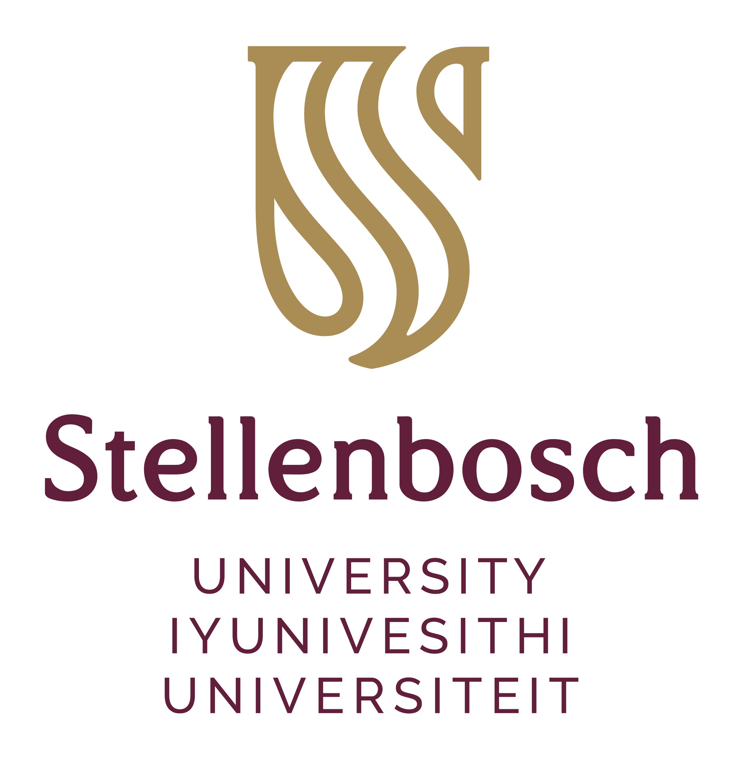
Striking a fine balance between an institution with heritage and the need to progress into the future, the new ‘S’-stream logo replaces the ‘S’-leaf logo that has been in use since 2000 to visually communicate the objectives and goals encapsulated in the university’s Vision 2040.

“Our new logo is modern and streamlined, yet still has the gravitas of a classic and elegant logo, with immediate presence and visibility, as befits an institution with world-class academic standing, aspiring to be Africa’s leading research-intensive university by 2040,” said Rector and Vice-Chancellor Prof Wim de Villiers.
The rebranding initiative was spearheaded by Deputy Vice-Chancellor: Strategy and Internationalisation, Prof Hester Klopper, who stressed it was a co-creation that followed extensive engagement with at least 3 100 university stakeholders.
According to Prof Klopper, a comprehensive audit conducted in 2018 indicated the need for a differentiated brand positioning. Work on the refreshed visual identity began in November 2019 with the appointment Boomtown, who also designed the final version of the logo in consultation with SU’s branding team and Iaan Bekker, an executive creative consultant and the designer of South Africa’s coat of arms.
At the heart of the new logo design are two elements. The first is the ‘S’ of ‘Stellenbosch’, expressed in rhythmic lines that resonate the warmth and vibrancy of the African continent and – together with the counter spaces in between – are a reminder of entopic symbols that span across cultures and languages. The lines also form streams that flow continuously within a ‘U’ for ‘University’.
The logo also contains the words ‘Stellenbosch’ and ‘University’, in each of the three South African languages used by the institution, namely English, isiXhosa and Afrikaans. SU’s institutional slogan, “forward together, sonke siya phambili, saam vorentoe”, again in the University’s three languages, constitutes the final element, with all logo components bound together into a cohesive whole.
As the colour maroon is the most recognisable, distinctive brand asset that differentiates SU from competitors, it has been retained as SU’s primary colour. In addition, the colour gold has been introduced, signifying SU’s resolute commitment to excellence. In applications of the logo, an extended colour palette will be used, reflecting the earthiness and vibrancy of the University’s natural surrounds.
Typographically, the new visual identity speaks to the Stellenbosch word mark, a contemporary yet timeless slab-serif font, which was developed and crafted specifically for the institution.
Said Boomtown CEO, Glen Meier: “The new visual identity demonstrates excellence as being at the heart of everything the university does while still reflecting the diversity of its people, their inter-connectivity, their links to the values of the institution and the inspiration they draw from the campus’ natural surroundings. We are very excited about the impact it will have in moving SU towards the realisation of its vision.”
- MRF Unveils Latest MAPS® Data - 20th February 2025
- The BRC announces changes to the board and updates for 2025 - 17th December 2024
- Top 50 DSTV TV programmes – October 2024 - 12th November 2024
